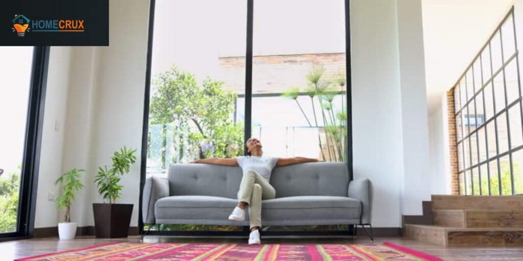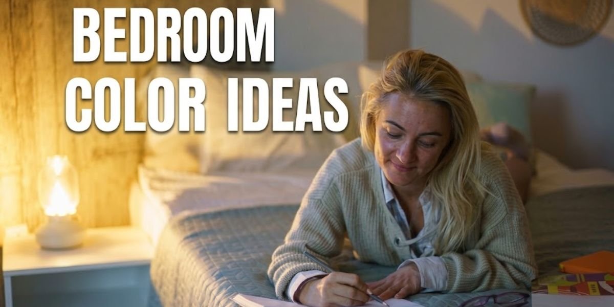
Selecting a bedroom palette is an exercise in sensory architecture. The goal is to move past simple aesthetics and treat color as a functional tool for recovery. A well designed room should manage the perceived volume of the space while dictating the emotional temperature of the environment.
As a professional designer, the first tip I give is to look beyond the name of a paint color and analyze its Light Reflectance Value or LRV. This numerical scale tells you exactly how much light a color reflects versus absorbs.
For a restful sleep environment, the most effective colors typically land in the 40 to 60 range. This provides enough depth to feel secure without the room becoming a dark cave.
Expert strategies now prioritize biophilic cocooning. This means moving away from clinical, cold grays and toward tones that connect with the natural landscape.
We are building high performance spaces that regulate the circadian rhythm and provide a necessary break from digital overstimulation.
1. Warm Mushroom Beige
Mushroom Beige is the definitive high end neutral. Unlike the yellow based tans of the past, this tone contains a stony taupe undertone. It creates a grounded atmosphere that feels incredibly expensive when paired with raw linen and white oak. It is specifically effective in north facing rooms that naturally feel cold.
2. Creamy Off-White + Natural Oak
This is the foundation of the Quiet Luxury movement. By using an off-white with a hint of ochre, you avoid the sterile hospital feel of standard white. The natural oak provides the biological warmth needed to make a minimalist room feel like a home. This pairing is currently dominating high-end residential renovations across the country.
3. Sage Green Mist
Sage Green acts as a physiological sedative. It mimics the desaturated tones of a forest floor, which is scientifically shown to help lower heart rates. To keep it professional, ensure your sage has a heavy gray base. This prevents the green from looking too bright under artificial evening light.
4. Clay Terracotta Accent Wall
Clay and Terracotta are part of a major shift toward earth-centric design. A terracotta accent wall adds immediate soul to a new build. I recommend a matte or lime wash finish to give the clay a tactile, breathable look that catches light in different ways throughout the day.
5. Soft Taupe All-Over Walls
Taupe is the perfect bridge for those who find beige too dated and gray too cold. Applying this color to the walls, baseboards, and even the ceiling creates a monochromatic envelope. This technique blurs the boundaries of the room, making a small space feel significantly larger. Designers keep returning to this because it just works.
6. Sand Beige + White Linen
This is the gold standard for California-inspired modern homes. The objective is to layer varying depths of sand and stone. Because the palette is limited, the luxury comes from the quality of materials such as heavy wool throws and high thread count cotton.
7. Muted Olive Green
Olive is a heritage color that feels established. It is a sophisticated alternative to standard green, offering a muddy, organic depth. It works beautifully as a backdrop for dark walnut furniture and black metal architectural details.
8. Dusty Lavender Gray
For a subtle introduction of color, Lavender Gray is a masterstroke. The gray presence keeps the purple from feeling juvenile. It creates a shadowy, romantic atmosphere that is ideal for a primary suite intended for total mental decompression.
9. Warm Ivory + Black Accents
This is a high contrast strategy that never fails. The ivory provides a glowing, soft base, while black accents, such as a slim bed frame or a linear light fixture, provide the modern structure. It is an editorial look that feels both sharp and livable.
10. Deep Forest Green Walls
Dark and moody bedrooms are a major professional trend. Forest Green creates a restorative, cave like environment. When using a color this dark, treat the walls as a neutral. Add camel toned leather or brass hardware to ensure the room feels curated rather than gloomy.
11. Charcoal + Warm Wood
Charcoal is the pinnacle of masculine luxury. The secret to making it work is the presence of warm wood grains. Walnut or cherry furniture provides a biological warmth that counters the coolness of the gray, creating a balanced, professional looking space.
12. Pale Blush Neutral
This is not a traditional pink. A Pale Blush Neutral is a beige with a micro drop of red pigment. It is designed to mimic the soft glow of a sunset, making it the perfect choice for bedrooms that lack natural daylight.
13. Greige (Gray + Beige Blend)
Greige remains the most versatile color on the market. Its brilliance lies in its ability to shift. In the morning sun, it feels like a clean gray. In the evening, it warms up into a cozy beige. It is the most reliable choice for maintaining a high resale value.
14. Cocoa Brown Accent Wall
Brown is a major comeback story in luxury design. A rich Cocoa Brown provides a level of warmth that grays simply cannot achieve. It mimics the feeling of a private library and creates a strong, grounded focal point behind a headboard.
15. Soft Blue-Gray Wash
This one never fails in real homes. It is universally calming. By choosing a desaturated wash version, you achieve a sophisticated look that feels like a quiet sky rather than a child’s nursery.
16. Warm White + Linen Textures
The hallmark of Scandinavian design. By removing color, you force the eye to focus on the purity of materials. Use varied textiles like chunky knits, woven jute rugs, and silk pillows to create a space that is visually rich despite the lack of pigment.
17. Muted Burgundy Accent
Burgundy is the new luxury wildcard. It is a deep, wine inspired tone that adds formal sophistication. It works best in a room that is otherwise dominated by cream or light gray, providing a rich, historic visual anchor.
18. Stone Gray + Natural Textures
Stone Gray pulls directly from the landscape. It is less industrial than standard gray and feels more like a natural rock formation. It pairs beautifully with raw wood beams and stone fireplace surrounds, making it a favorite for modern rustic homes.
19. Beige + Olive Combination
This represents the peak of earth tone layering. Beige keeps the room feeling light and accessible, while olive green provides the necessary visual weight through window treatments or accent chairs.
20. Sandstone Pink Neutral
Sandstone Pink is a dusty, desert inspired tone. It behaves like a warm neutral but has a distinct personality. It is a perfect choice for guest rooms where you want to create a welcoming and memorable environment.
21. Deep Navy Blue + Warm White
The quintessential transitional palette. Navy blue provides security and depth, while warm white keeps the room from feeling claustrophobic. You will see this in upscale suburban homes from the East Coast to the South.
22. Smoky Taupe + Brass Accents
Taupe takes on a high end glow when paired with unlacquered brass. The metal reflects warmth back onto the walls, creating a shimmering, gold like effect during the golden hour of late afternoon.
23. Warm Camel Tan
Camel is a rich mid tone that feels like luxury leather. It adds immediate texture to a bedroom. It is a fantastic choice for homes with a lot of greenery, as the tan and green create a high contrast, natural look.
24. Soft Eucalyptus Green
A lighter, more silvery alternative to sage. Eucalyptus has a cooling effect, making it ideal for bedrooms in warmer climates. It feels fresh and revitalizing, creating a clean space to wake up in every morning.
25. Off-White + Black Frame Contrast
This uses the architecture of the room as the primary decor. By keeping the walls off-white and the window trims or bed frame black, you create a graphic look that is incredibly easy to style and maintain.
26. Mocha Cream Blend
Mocha Cream is a comfort neutral. It is a soft, easy to live with color that provides a consistent background for various furniture styles. It is particularly effective in large rooms that might feel too vast with pure white.
27. Muted Teal Accent Wall
Teal is a professional choice for adding personality. A Muted Teal—one tempered with gray—provides a jewel like depth that is especially beautiful under low wattage evening lighting.
28. Warm Gray-White Layering
This technique involves painting walls a light gray and the ceiling a slightly warmer white. This creates a subtle visual tension that makes the architectural details of the room pop without needing bold colors.
29. Earthy Rust Orange
Rust Orange is for the bold. It is best used in textured formats like velvet or linen. Pair it with dark woods and navy blue to keep the energy sophisticated and grounded.
30. Soft Sand + Clay + Ivory Blend
The final and most advanced strategy is the triple neutral layer. By using sand on the walls, clay on furniture, and ivory for the bedding, you create immense visual depth. This is where luxury is found in the subtle shifts of tone rather than loud patterns.